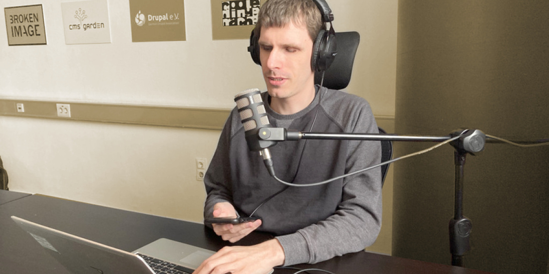
I always experience exciting moments with my colleague Dennis. As a proven expert on accessibility, he regularly points out to me that I am not yet sufficiently aware of accessibility. Today we had a photo session.
Photogenic?
As a sighted person, I never asked myself how I came to the decision whether the photo of me was "suitable". I looked at it - and deleted it if I didn't see myself in it, couldn't discover my photogenic side or, quite banally, had just closed my eyes. But what does Dennis know about it?
As a blind man, he has no reference to the flood of optical stimuli. Nor the habit of looking the way one does - in job application photos (serious?), on Insta (with filters?) or on Tinder (seductive?) ... What a stress we sighted people are under to distinguish ourselves from the pictures of others in the respective situation and to put on our "photo face"!
I was a little envious
So I in the role of photographer. He in the role of model. Actually, he just needed a picture to serve as an illustration of his working environment for his blog post. Task was:
We need a lead picture of you for your post. Ideally, it should show you working on the task at hand.
Easy?
The discussions in the run-up are exciting
How do you actually want to come across? What kind of seriousness, expertise, self-image, naturalness, etc. do you want to portray and how do we decide whether it fits?
In his typical manner, only one came:
What do I know.
It quickly became clear that we needed people (several!) to describe the respective photo aloud (pictorially) - and Dennis listened. Unlike the typical, terse "alternative descriptions" (= alt text or alt attributes for images), which are read out to blind people by the screen reader or displayed instead of images in the browser if the connection is poor, here he had the opportunity to sort the feedback into (his) imaginary scale by asking specifically. It took a few photos before the inner scale said "yes".
Closed eyes don't work at all
The following phenomenon was interesting: when we took photos of Dennis with his eyes closed, we immediately had the impulse to delete these photos. We sighted people found them unsuitable. Why is that? Here the suspicion of viewing habits suggests itself. It just doesn't work. It's a bad photo. There were no qualified statements.
Final polish
Then you look at the "winning picture" - and you know your GIMP picture editing programme. Swap a bit of colour, optimise the crop, set exciting accents, adjust saturation. You know the drill. But what does sepia mean? What greyscale? What is focus on details? Who does that serve?
Feedback round
What I found fantastic after finalising the photo was the trust Dennis gave us:
OK. If you say this hits me well and serves its purpose, go for it.
Even more fantastic was his comment after publication, because he had had uninvolved third parties explain in detail what all is where and how in the photo. His feedback to us:
The microphone has a completely different response! I would never use it like that and it shows that the situation was staged. Please pay attention to the correct use of the equipment next time.
