In the third part of my report on Exponuevo.de, I told you about the dress rehearsal where we tested our interactive setting under real conditions.
There were only a few days left until the actual premiere: Last chance for the ultimate polish :) In addition, there were a few "sideshows" so close to the end that we could only really take care of in detail now.
Online shop
Artists have to sell something if they want to make a living from their work and recoup some of the work they have invested. Galleries and openings mean a lot of effort for them, but are free for guests. But such events are necessary to show the works and attract customers willing to pay.
With a virtual exhibition, of course, the associated shop is also digital. Since we were in a hurry to find an open source solution in the e-commerce sector with which we already had resilient experience, we opted for one of the most popular platforms: Shopify. This offers a starter version with basic functions for a quarter of a year at a monthly price of 1 euro. However, setting it up - with countless presets and option menus - was quite time-consuming on the software side, which is why Friedel was glad that he only had to deal with it now, when the bigger, more crucial things had already been managed. He posted cards, posters and calendars with reproductions of his paintings and was able to link the originals from his exposition that were still available as products with prices.
Reminder mailing
Incidentally, configuring the newsletter manager Listmonk a week earlier was just as time-consuming as setting up the webshop. Because this is quite complex. Not only the integration and synchronisation from external databases is complicated. Friedel first entered the more than a thousand contacts he had accumulated over the years. Depending on "attributes" or roles, he sorted them into different address books, wrote group-specific templates and finally sent the invitations with a click. But it remained unclear whether the recipients even received the automated message. He did not get a success message from the programme and unfortunately could not "look" anywhere in it. This left us a bit perplexed. So he decided to "follow up" again and send out an appointment "reminder". The subscribers to the diary who had joined in the meantime were also to be informed. This time he used the tried and trusted mail client Thunderbird. The circulars went out in batches, which meant more "manual work" but was easier to track afterwards.
And finally, we had to go back to the details of the entry page.
User tutorial
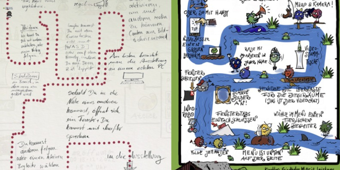
As we assumed that many guests had never used WorkAdventure before, we wanted to provide them with a clear and concise guide. On a start map, they should be able to quickly grasp how to handle the interface, communicate with others and use the map's extras. Friedel had first outlined the most important functions textually. From this, a visual path emerged and from this, in turn, the idea of presenting the whole introduction as a river course, like in a board game. So he built another map for which we defined certain places with assignments and actions.
With the Woka avatar, you could just move along the stream and get a feel for navigating right away. On the shore, you met drawn monsters that gave you further clues. We integrated water noises as sound. Only when you had travelled this entire route did you end up in the foyer of the exhibition.
After we had polished it again, everything was ready for the big event.
And you can find out much more about the project on the website Exponuevo.de. Take a look there!


